Wednesday, 30 March 2011

Week 9: SAATCHI GALLERY

Sightlines

The Saatchi Gallery, more so than most other museums we have visited, allowed visitors to engage with the artwork from multiple perspectives. This was most evident in the "Up" and "Down" pieces that our tour guide first pointed out. Because these pieces were centrally located in the gallery, we were able to observe them from every angle, which made them more impressive because we saw every footprint, etc. within the clay. Had these been in a corner or on a wall, we would not have gotten the same expereince. I really appreciate this type of gallery design, especially because there were so many three-dimensional pieces like these in the Saatchi Gallery. Arranging the pieces so that the museum visitors can view them from multiple perspectives gives greater deference to the pieces themselves. In other museums we have visited, especially the Tate Modern, certain exhibits have allowed for similar multiple sightlines, but this was most pronounced in the Saatchi. 


Didactics

As someone who is an art "outsider," it often frustrates me when text descriptions of a piece are lacking. Usually, if I see an unusual, confusing piece, I immediately consult the title and artist description in search of explanation. However, after listening to our tour guide describe the inhibiting/constraining effective of text, I see the relationship between art and didactics a bit differently. I appreciated her point that the more text there is describing the piece, the more that contributes to a static meaning of a piece, which is usually not the aim of the artist; rather, minimalistic text allows visitors to interpret the artwork on their own, even if that means a frustrating initial experience, as I witnessed. 


Collection

The Saatchi Gallery was certainly the most unconventional museum we have visited during our course. Even in comparison to the pieces in the Tate Modern, the artwork at the Saatchi is pretty out there. The building itself has a beautiful interior, and I often felt that some of the pieces didn't belong is such a bright, pristine building off of Sloane Square. I appreciated certain pieces individually, but others frustrated and/or frightened me. Specifically, two pieces on the ground floor did not sit well with me. The first was the taxidermic goat intertwined with a Dior perfume bottle. I will never see my Dior perfume bottle the same again after this experience. The other piece that disconcerted me was the sort of horse structure with blue plastic and a fur coat draped over it. These were the last two pieces I saw before leaving the gallery, which probably contributed negatively to my overall interpretation of the collection. In retrospect, I can appreciate the Saatchi Gallery for being the most adventurous collection we have visited, although I'm not sure how frequently I would return in the future.


Saturday, 26 March 2011

Week 8: Street Art

After viewing "Exit Through the Gift Shop," I've been really intrigued by street art and the people who create it. I was completely unaware of the expanse of street art culture, especially in large cities like London, and I find myself more aware of graffiti across the city now than I was before. This is a good thing, because a lot of the artwork that I do see, I really enjoy. It's something that I had clearly been neglecting to notice before. This week during our History of London class, we took a walking tour around the East End near Brick Lane. This area is basically London's answer to the Village in New York--jam packed with culture. Obviously we saw a lot of street art, and not just run of the mill spray paint tags. As a result of seeing the Banksy movie, I also found it easier to distinguish between "legitimate" street art, and mere decals/stickers imitating as such. It is difficult for me to categorize any of the following pieces as "diminishing" the landscape, mostly because they were all found in the East End, which has sufficient character to sustain such graffiti. The East End is one area of London where they wouldn't describe street art as vandalism, while a place like South Kensington might be less receptive to graffiti. While I wouldn't categorize these pieces as classically beautiful, I think all four of these examples enhance the landscape they inhabit. 


This first piece is located within a mural at the entrance to Brick Lane. This area has been home to immigrant communities for centuries, and is currently largely inhabited by a Bangladeshi population. I like the juxtaposition of a static black and white pattern with bold colors. The text could be interpreted as commentary on the constant flux of the immigrant community. The color of the German flag dominate the piece from the top, so it could also be a political statement. Either way, it is an eye-catching part of the landscape at the entrance to Brick Lane, and gives you a sense of what kind of art you'll find within the community.


This is one of my favorite pieces of street art that we discovered in the East End. Not because I like birds (I don't, at all), but because it was the most striking art that I saw during our tour, despite its lack of color. It was located on an unassuming side street off of Brick Lane in an area where there was no other graffiti. The lack of other art made this giant bird stand out even more against the landscape. I haven't a clue to its significance, but this kind of random design is exactly what I would want and expect out of London's East End. If I lived in this apartment building, I might not appreciate living in a bird-adorned establishment, but from an outsider perspective, it's interesting and also imposing.


This piece stood out to me because I recognized the design from the "Street Invaders" campaign that was briefly mentioned in the Banksy movie. It was located behind some warehouses, near the Women's Library in the East End. While this is not my favorite artwork, I appreciated seeing the work of a more mainstream street artist that I've actually heard of before. Short of seeing a Banksy, this was still quite impressive. I was under the assumption that street art put up by well-known street artists like Banksy, Shepard Fairey, or Space Invaders would be so short lived that it's rare to actually see it in the streets. Maybe this is evidence to the contrary, or maybe there are a lot of famous street art pieces around London that I haven't noticed yet! Last time I was in New York, I walked right past a Banksy, and didn't notice it until my brother pointed it out to me. I'm determined to be more vigilant here in London.


This piece is definitely my favorite of the street art I discovered in the East End. The reason I appreciate it so much is because of the way it was made, rather than the actual image. From afar, I assumed this was a poster, or maybe some kind of paint; from closer up though, I realized that the detail in this image is actually made from carving out small pieces of the concrete wall it is located on. This impressed me more than any graffiti street art that I saw all day, simply because of the time and detailing spent on creating this face, and the end result is very impressive, especially up close enough to see each piece that was chipped out. This was located in the same warehouse back alley/parking lot where I also found the Space Invaders. There were other examples of street art located here as well, so I guess it pays to wander off the beaten path, especially when you're on the hunt for street art.

Saturday, 19 March 2011

Week 7: Ottoman Art

During my spring break trip to Turkey, I was exposed to artwork in Istanbul that was unlike many of the collections I’ve seen while in London. Often, when we visit art museums in London, there is an emphasis on classic, European Renaissance artwork. In other words, because I’m living in a major European center of culture and history, it makes sense that so much of the artwork here reflects that. I have a great affinity for these classic pieces, but I sometimes feel they can become monotonous, especially in large collections. It was both unusual and refreshing then, to discover a new style of art in the museums and mosques of Turkey. Below are two samples of what I consider to be European art: a portrait of Henry VIII at the Tate Britain museum, and the ceiling of the Banqueting House by Rubens, both in London. Artwork such as these were nowhere to be found in Turkey.


           What I found instead of these pieces in Turkey was brightly colored patterned tiles throughout the city at holy cites. There were fewer portraits, with an emphasis instead on creating harmonious sacred environments inside mosques. As the capital of Turkey and a bridge between Europe and Asia, Istanbul serves as both a religious and cultural epicenter for the country. The result of this status is myriad mosques sprinkled across the city that serve as places of worship, museums, and tourist attractions. The mosques are unique pieces of art on both the outside and the inside. The stone structures are covered on the outside with gilded Koran scripture, and are always recognizable from their domes and steeples. Two of the most notable mosques are the Blue Mosque and the Hagia Sophia, both of which have striking exterior features and are pictures below. The mosques stood out because of their structural differences from their European counterparts: Christian churches. On the interior of the mosques, their differences became even more pronounced. Inside, every mosque was unique, but each with the same incredible intricate, rich designs on the walls, with the most ornate patterns on the ceilings. Rather than the gilded, stained glass interior of many European Churches, which are heavy with idolic statues, the interior emphasis of the mosques seemed to be on color, design, and harmony. Below are some of my favorite interior designs of mosques in Sultanahmet, Istanbul. 


The exterior of a Christian church in Istanbul, in contrast to the mosques below:


           Seeing so many examples of Ottoman artwork made me critically recall the experiences in art museums I've had while in London. In the second week of our program, we visited the Victoria & Albert Museum as a class, where I was interested in the Ottoman exhibit. At that time, the Ottoman tilework and fabric examples were intriguing to me because of their place of origin, rather than because of their beauty. After my trip to Turkey, I revisited this exhibit at the V&A last week, wondering if I would interpret them differently than I did the first time. My response to the tile work was not as it had been the first time I visited the V&A, and was not the same as my response in Turkey. This time, I connected to the tilework because of my own personal experience in their place of origin, and I was nostalgic for their original environment. For some reason, it was hard for me to get past the fact that I was observing these patterns through glass inside a museum in England, and that completely changed my experience. Ultimately, I’ve learned that the environment in which I’m exposed to artwork has a great impact on how I respond to it. In the case of the Ottoman tiles especially, I am able to appreciate them more when they are “in their element.” In other words, to see beautifully intricate, rich colors on the interior domes of mosques in Turkey is incredibly impressive; on the other hand, to see them behind glass in a museum in London is not doing them full justice. While their beauty is still the same at face value, they do not have the same aura of spirituality, which does so much to enrich the experience of their audience. Below are some examples of the Ottoman artwork inside the V&A museum, which are lacking personality in comparison with the tilework in Turkey, above.


Sunday, 6 March 2011

Week 6: NATIONAL PORTRAIT GALLERY

1. Logo: This logo, like the National Gallery from last week, is a bit blasé to me. It is black and white, without any identifiable icon, and is purely typeface--to me, this doesn't give it much personality, which is a shame because the artwork within the gallery has a lot of personality. However, I do like that the logo is arranged in a perfect square, a shape which frames the title. This relates to the framed portraits throughout the gallery, so there is some connection between the logo and the collection. I would probably suggest creating some kind of simple icon, perhaps even an empty frame itself, to use in place of the National Portrait Gallery type, which could be less attractive on banners, pamphlets, maps, etc.


2. Self Portrait: I chose the portrait of Sarah Jennings, Duchess of Marlborough, by Sir Godfrey Kneller. Painted in 1702, this portrait has many qualities with which I identified. First, I love her pose. It is very classy and graceful, which are qualities I tirelessly strive to embody (...only partially joking). Second, I love her dress. It is quite simple, but elegantly draped; most importantly, it is shiny! I love anything that sparkles or shines, and silver is my favorite metallic colour. Finally, I love her makeup. She is wearing rose blush, which I wear every day! Basically, if I were around at the turn of the 17th century, I would hope to look like the Duchess.


3. Sarah: I chose the famous portrait of Lady Diana by Bryan Organ to express the essence of my friend Sarah. Sarah, while vibrant, social, and beautiful, is also occasionally clouted by melancholy and contemplation. To me, this portrait captures the conflicting qualities of Princess Diana, which I also see present in Sarah. Effortlessly pretty, with beautiful clothing that only enhances her natural beauty is how I see both of these women.


4. Karl: I immediately projected my friend Karl into this portrait of Alexander Pope at the National Portrait Gallery because of the they are both poets. I also love the portrayal of Pope from a profile angle, of which there were very few in the Gallery. For some reason, I think of Karl from a profile perspective, because I think it makes the subject seem more contemplative and unique, which is exactly what he is. I could definitely seek a portrait of Karl in this style on the cover of his imminent hip-hop album, or on the dust jacket of a book of his poetry.


5. Amanda: I saw my friend Amanda reflected in this portrait of Elizabeth Burnet mostly because of her facial expression. She is politely bemused, and looks like she was probably journalling or reading a book before being interrupted to sit for the portrait. Amanda is fair and beautiful, and doesn't have to put in much effort to look that way. The simple dress and hairstyle, with a slight smile in this portrait I see in Amanda almost every day. She is easy to overlook at first, but deserving of attention.


6. Lauryn: I love this portrait of Lady Colin Campbell for so many reasons. I love her pose, which is so natural but also beautiful and effortless. I love her dress, especially the fact that it is black, which for that time period should evoke mourning, yet she is full of life. My favorite part of her dress is the sleeves, which sort of blur at the edges and are quite feminine, yet bold. I saw my roommate Lauryn reflected in this portrait. On a surface level, Lauryn wears a lots of black and is quite stylish, but she is also gorgeous and graceful, like Lady Colin Campbell.
 

***Because I drew my portraits in pencil, they are a bit hard to see in these photos. However, I will be happy to display them in person so that you can get the full effect!


Wednesday, 16 February 2011

Week 5: THE NATIONAL GALLERY

1. Logo: Unfortunately, I do think this "logo" is merely a typeface. There is very little personality to the logo, and I don't think it does justice to the collection in the museum. I also don't understand the emphasis of "Gallery" as the focal point of the logo, because I think that "National" would be a more appropriate point of emphasis. The Museum is located in a grand building with a roman column facade, and it is a central landmark on Trafalgar Square. This design and location warrants a better logo. Further, because of the classical, famous paintings in the collection, I would propose a new logo that would either be a classic typeface that is at least more exciting than the current one, or a simple and comprehensive symbol to put on merchandise, banners, etc.


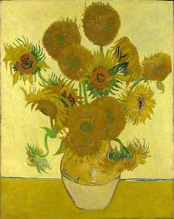
2. van Gogh: I'm conflicted about my opinion of the van Gogh paintings. I have heard about Vincent van Gogh since I was a child, and seen his works manipulated in prints and on merchandise, so it was a strange experience to observe the actual pieces in person. Ultimately, I think the paintings did live up to the hype. However, I didn't have a particularly high opinion of his artwork to begin with. As a result, I was impressed with the texture and brushstrokes of the oil paints that I was able to see close-up, and which aren't really reflected in the myriad prints of his work that I've seen. But in terms of the paintings being visually pleasing to me personally, I was underwhelmed. I should qualify that this is largely in reference to the particular sunflower painting in the collection, which was my least favorite van Gogh in the gallery. It just doesn't stand out to me as beautiful, harmonious, or cheerful, which I think is what he was going for. I love sunflowers and the color yellow, but I do not particularly enjoy this painting. Perhaps I was put off by the lack of contrast, which usually characterizes impressionist paintings. My favorite van Gogh was the Wheatfields, which conversely I did think was quite beautiful. This painting definitely employs the contrast of colors typical of impressionism. The swirling paint strokes were reminiscent of his signature style in Starry Night, and I love the dramatic differences between the colors in the landscape. Perhaps if there was a broader collection of van Gogh's work in the National Gallery, I could have appreciated his body of work more comprehensively.


3. Object of Desire: I have two objects of desire. The first would be suitable for my mansion/palace/villa, while the later would be suitable for my (realistic) future home. Pierre Mignard's "Marquise de Seignelay and Two of her Sons" is one of my favorites from the collection. It is French, bright, bold, dramatic, and regal. This is exactly the kind of artwork I would hope to have in my future palace. Ordinarily, I wouldn't like to have a painting of actual people on my walls, but I could make an exception for this one. Also, it would have to be in a grand, intricate golden frame, of course. The second object of desire that I could realistically put in my future home is "The Western Railway and its Exit from Paris" by Charles Angrand. The subject matter of this painting isn't of much interest to me, but the colors of the oil paint and the brushstrokes stood out to me immediately. I specifically am drawn to the yellow-hued field in which an onlooker sits. I think the colors in this field are beautiful, especially in combination with one another. I would put this painting up on my wall during the springtime, or possibly late summer, but I wouldn't keep it up year-round.


4. Gallery/Display: I loved the display style of the National Gallery, especially in comparison to the Tate Modern last week. The dark, richly colored walls in shades of plum and turquoise and occasionally with patterned wallpaper, combined with dramatic, ornate golden frames was much more appealing to me than the blank, utterly white walls in the modern style. This really intensified the drama of the galleries, but I liked it. I think that giving these paintings a sort of regal surrounding does them greater justice. I also preferred the salon style because, as I discussed last week, there is less pressure to focus on one piece. This seems counterintuitive to be pressured by a blank white background, and feel at ease with a dark, dramatic background, but for some reason that's how I responded to the two different gallery styles. Also, I think I like the rich colored walls and ornate frames because that's how I want to decorate my house as an adult--the more gold, the better.

5. Exploitation/Merchandising: I don't think all the merchandising in museum gift shops diminishes the artwork, but some of it certainly does. I think producing postcards, poster prints, and books of the artwork is acceptable because it's not really manipulation of the image, but rather reproduced and appreciated for the piece itself. The National Gallery gift shop included all of these forms of reproduction, but they also stocked some rather demeaning products as well. In my opinion, selling umbrellas, neckties, refrigerator magnets, jewelry, and DVDs with images of famous paintings on them is unfortunate. I think the people who purchase said items probably don't appreciate the actual piece of art as much as they should. I also think that when an image of a famous work become so ubiquitous, people on the street would start to take a masterpiece for granted. Their images are on everyday, forgotten objects that don't do justice to the pieces of art. Rather, they are mass produced, and in my opinion, belittle the classic paintings they depict. That being said, I'm guilty of owning a few of these objects myself.


6. Object of Appreciation: The painting that caught my attention more than any other in the collection at the National Gallery was "The Execution of Lady Jane Grey" by Paul Delaroche. Once again, my reason for appreciation is the subject matter of the painting, which again reflects my interest in history, specifically British history. Jane Gray is particularly interesting to me because it was her rival, Mary Queen of Scots, who was responsible for her beheading after only nine days on the throne. She was only sixteen when she was executed, and her youth is clearly visible in this painting by Delaroche. The painting is incredibly dramatic, with dark shadows surrounding the central, bright angelic figure of Jane Gray, on her way to the chopping block. Her figure is clearly distraught, young, and scared, and the executioner dawned in red clothing waits exasperatedly to finish his duty. The painting is very striking (no pun intended), and I'd love to revisit it again.

Thursday, 10 February 2011

Week 4: TATE MODERN

1. Logo: The variations within the Tate Modern logo are beneficial to the brand, in my opinion. Around the museum, in the shop, cafe, and on brochures, the Tate logo morphs from crisp and clear to blended and blurred. Most importantly, the logo is still always legible and recognizable. I think this variation significantly relates to the Tate Modern collection, which itself varies greatly in the period and origin of the pieces. The varied logo encompasses the broad range of contemporary art in Tate Modern, but also represents a consistent identity with the foundational base of "TATE". I think the blended Tate logo is much more appropriate for the Tate Modern museum than for the Tate Britain museum that we visited last week because the logo itself is modern and relates to the art collection much more so than the more traditional art in Tate Britain.


2. Free Admission: I have to constantly remind myself how lucky we are to visit these London museums for free. I can't imagine visiting art museums that house famous works of art for free in the United States. I do think that museum culture in the United States has a reputation as being only for the affluent. Going to a museum seems to be a high-brow form of entertainment, simply because the cost of admission to many museums, especially in big U.S. cities, is so high. This is certainly a deterrent for students, who usually have limited funds. Even though they may have an interest in art, the cost can be a major turn off, which is unfortunate for those individuals and also for the American museum culture more generally. In the four museums we have visited thus far in London, I don't see the museums populated exclusively by upper class visitors. Instead, I've seen families, students, young professions, etc.--people all across the spectrum. In a city as vibrant as London, I think museums add a significant amount to the cultural opportunities available to Londoners and visitors alike, and I think the U.S. should consider a museum model more akin to that of London.


3. The Unilever Series: Al Weiwei: I appreciate that the sunflower piece is a commentary on the relationship of the individual to the masses; however, I am uncertain if the display answers such philosophical life questions such as "what does it mean to be an individual in today's society." If a visitor to the museum wanted to, I'm sure he or she could contemplate on the exhibit and extract answers to such poignant questions. In my opinion, however, I think the exhibit is intriguing and impressive without delving too far into its intention. When I first saw the sea of porcelain sunflower seeds from above, I honestly thought I was looking at gray textured carpet. Once I actually went down to the ground level, I was really taken aback. I could focus on one individual seed spilling toward the edge of the concrete plane they rested on, and then look up to see literally millions of these same seeds stretching to the exterior wall of the museum. I watched the short film on the artist's process, and I was struck by the scenes in which elderly Chinese women sat and hand-painted every single seed. For these women, I think it would be easier to distinguish and appreciate the value of individuality in the seeds, as they were the ones physically creating them. As a visitor to the museum, it is hard to fathom the work that went into each seed, yet I appreciated the magnitude of the project. In relation to the other installation art we have seen this semester, I like this exhibit the most. While it attempts to evoke reaction and contemplation in the philosophical realm, I am able to appreciate the beauty and simplicity of the work alone, which cannot be said for other exhibits (mainly the Coral Reef).


4. Display: I have noticed more and more with each museum we visit that the wall color, frame, and gallery arrangement have much more of an impact on how I perceive a piece of art than I originally thought. The striking white walls in modern art museums like the Tate usually make me feel uncomfortable. In galleries with sparsely hung, large pieces on utterly white walls, I feel pressured to be overwhelmed by a piece. There is so much attention and focus on one single piece because of the empty white walls surrounding it, and for some reason this is unsettling to me. Even if I genuinely like the piece, I still feel pressured to stare at it in awe for a long period of time. In contrast to this experience in modern art galleries, I have appreciated the variation in wall color, frame, etc. in the other museums we have visited, mainly the V&A and Tate Britain. Especially in the romantics gallery last week, I felt as ease with turquoise walls, gold frames, and salon style hanging, and I definitely prefer this arrangement to that in modern galleries.


5. Power Station to Museum: Tate Modern is architecturally the most unusual museum I've ever visited, both inside and out. When I first came to the Tate a few years ago, I was sure that my brother was wrong when he pointed from the Millennium Bridge and said "that's the Tate Modern museum." It does not look like an art museum, and in fact I initially thought it was a terrible eyesore on the Thames riverbank. Now that I've visited it a few times, I appreciate it more. The outside is striking and provoking, which is exactly what its subject matter aims to be. Inside, the amount of open space is overwhelming. It truly feels like a gutted power station, yet there are swarms of people clambering about. I also think the interior layers of the museum are interesting. The ground and first floors are bare, with the exception of a small cafe, gift shop, and the featured exhibit (in this case the sunflower seeds). The main exhibits are spread out on two floors, with a floor for special exhibits sandwiched in-between. The top floor is my favorite, because the view of the city is stunning, and you can mingle in a comfortable atmosphere when you inevitably need a break from the artwork below. I suppose the concept for this museum is not one I would have chosen, which would have been almost a cliche futuristic, ultra-modernist glass building of some sort. In comparison, I think i quite like the power state Tate Modern better anyway.


6. Object of Appreciation: My favorite gallery in the museum was the Soviet street posters room. The prints in this room were initially produced by the Bolsheviks after the Revolution, and were continually produced under the reign of Stalin. The brightly colored propaganda posters were visible across the Soviet Union. I love this gallery because every space on the walls in filled, from the floor to the ceiling. The images are bright and animated, which reinforces Soviet patriotism and allows for hyperbolic representation of the political adversaries of the USSR. My favorite wall in the gallery was a collection of posters aimed at women in the Soviet Union. The messages ranged from telling women to keep quite and not spread political gossip, to appeals to the Red Army to protect the endangered women and children of the Soviet Union. I like the combination of women portrayed as figured who can actually contribute to the political culture (as seen in the top two posters of strong-looking women), to ones in need of protection (in the lower two posters). My favorite print in the room in called "The Mullah's Third Wife" by Josiv Gerasimovich in 1926. There's no description of who the woman really is (besides being the Mullah's third wife), but I love the color and shape of the painting. I think the red is very striking, a color which is ubiquitous in all of the posters as a symbol of Soviet power. This poster is simply beautiful, and I would love to return to it at the Tate or have a print of it myself.