
2. Navigation: I had a mixed experience with navigation within the Science Museum. I felt that the lifts and toilets were prominently marked throughout the museum, yet direction regarding exhibits, which should be the main focus of the museum, was lacking. Supplemental materials like the Science Museum Map were helpful because they were color coded and prominently marked. However, I felt there were not sufficient markings in the stairwells to direct you toward actual exhibits. There were numerous paths through the museum, which was nice because I could kind of explore on my own. A drawback to this was that I felt I may have missed some exhibits because I took my own path, rather than following a set path that I knew would cover every exhibit. I know you are meant to explore museums independently and make it a personal experience, but I felt lost more times than I felt comfortable with, especially in a museum geared toward children!


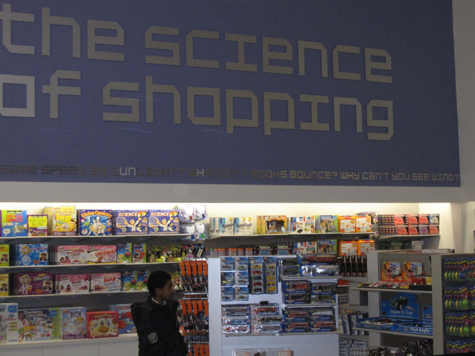
3. Shop/Cafe: The cafe and gift shop were an appropriate extension of the Science Museum brand, in my opinion. They followed the same bright, shiny, colorful patterns that were found throughout the exhibits. Uniform line structure in the form of tables and lighting also contributed to this "science" feel. The gift shop sold science-themed toys like lava lamps and microscopes, and had flying objects which were reminiscent of the airplane hanging in the main hall. Additionally, there was a prominent script circling the gift shop in the same typeface as the Science Museum logo, which I thought was a nice, consistent addition to encompass the room.

4. Display Cases: The display cases varied greatly in the Science Museum. The first floor exhibit included massive machinery that was not closed off much at all. This was effective because it allows the visitor to be struck by the size of scientific machines like steam engines and space capsules right from the start of their visit. This openness in display was carried into the space exhibit, where capsules and ships were similarly open to the viewer. The next room, however, disappointed me greatly. This room followed history along a timeline from the 1700s-2000, and the displays were dismal. Everything was behind glass, and had boring labels to boot. This disappointed me because as a history major, this should have been the most interesting to me! Framed pictures on gray walls, complimented by several "item temporarily removed signs" made the display cases in this exhibit dull. Upstairs, I was most impressed by the display cases in the "Who am I?" exhibit. These cases varied greatly in their contents, and the interiors were each designed uniquely. Each one of them was both fun and accessible. Text was integrated here with uniform titles across each display case, but a different system of labeling items in each distinct case.


5. Exhibits: My favorite exhibit, by far, was "Who am I?" I had two favorite display cases within this exhibit. Content wise, I loved the "What are you afraid of?" case. It was filled with glass jars of "phobias," which I thought was a fun and effective way to showcase the myriad of phobias that people have. It was fun to see common phobias, like fear of spiders, next to very unusual ones, like fear of air. Visually, my other favorite display case in this exhibit was "Why do I look like that?" This one caught my attention immediately because of the huge white peacock that spanned almost the entire case. The feathers reached almost every corner of the glass, which first caught my eye. Then I saw a leaping stuffed cat, which also caught my attention because I love cats. White was the overwhelmingly dominant color in the case. I found the museum, in general, to be very dark. Indeed, the "Who am I?" exhibit was in a dark room with dark walls, and therefore, the white of the peacock and the cat really jumped out at me.

6. Facts: I learned a lot at the science museum! First off, I learned that there is more to a museum than the exhibits! Thinking critically about the brand, layout, and presentation of the museum was really interesting for me. Science-wise, I learned that 1 in 8 people have at least one phobia. I learned that steam provides 75% of our electricity even today (which I find very hard to believe, but hey, it was in a museum, so it must be true?). I learned that twins can have a huge difference in skin pigmentation to the point that one is black and one is white. Finally, I learned that cats (and people) can have many more than 5 digits on each appendage!

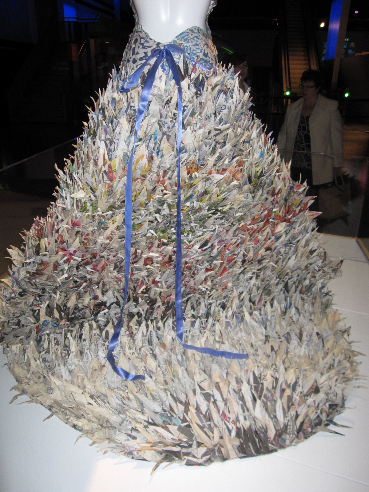
Other thoughts: I have a few thoughts that don't fit in with the questions above, but I still need to get them off my chest. First, I was struck by how prominent color was throughout the museum. I felt that wherever I looked, blue and orange were visible somewhere, and more often than not, they were very bright and prominent. I guess I would count this as a positive feature, as it makes things more exciting for kids. Also, it reminded me a lot of Nickelodeon. Second, despite bright blue and orange signs, I felt that a lot of the museum was very dark and not properly lit. The darkness was used effectively in wall displays, for example, in the space exhibit, but I frequently couldn't read text in the displays of other exhibits. Maybe my vision is just poor. Third, I appreciated the clear distinction between the different types of "science" in the museum. By this I mean, there was an obvious shift from the space exhibit, to the machines exhibit, to the atmosphere exhibit, to the natural world exhibit, to the future exhibit, and to the body exhibit. This made things somewhat easier to follow, though I still think the overall navigation was lacking. Finally, I loved the exhibit on fashion. I thought it was so unexpected, but they also framed the fashion in a way that made it relevant to the museum!

Looking forward to the next one!
No comments:
Post a Comment