

2. Ophelia: The portrayal of Ophelia's death that we saw in the National Theater production of Hamlet contrasts greatly with the painting of Ophelia's death by Millais in the Tate Britain. Millais' depiction of Ophelia's death is traditional. Whenever I have read Hamlet or seen classic productions of Hamlet, the death of Ophelia is complete with drowning, a flowing gown, and lots of flowers and greenery around her. Indeed, in Millais' painting, Ophelia's death is portrayed with all these trimmings, including ornate blossoms on her dress, and she is surrounded by nature. In the modern interpretation of Hamlet that we saw at the National Theater, Ophelia's death was nothing like this at all. The greatest difference was that her death was not actually portrayed on the stage, the audience was instead told about her death, rather than actually seeing it, like in most other productions. Additionally, because this production of Hamlet was set in a modern police-state, Ophelia was the victim of a sort-of mob hit, rather than her usual route of suicide. Therefore, there was no ornate death scene for Ophelia in the production that we saw.


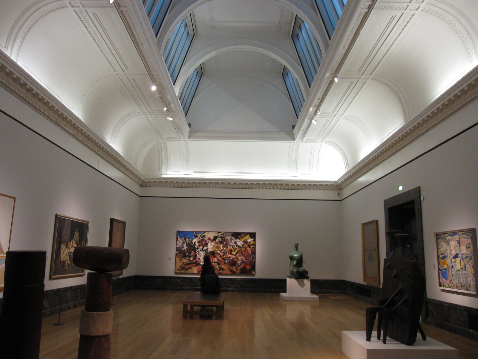
3. Display: I appreciated Tate Britain because their diverse collection of works allowed me to really distinguish display styles between exhibits. In one room there could be a modern sculpture gallery, and in another classic romantic paintings. In the modern style of gallery 11, the sparse white walls drew attention to the few pieces in the room. In addition to the relatively bare walls, the lines of the works were rigid, straight, and minimalistic. The result of this institutional setup was that the color and variation within the pieces really stood out. My attention was drawn to the pieces in these modern galleries immediately upon entry into the room, so the artwork was definitely the focal point. This contrasts with the display technique of the pre-Raphael style display in gallery 9, which had a much more ornate and almost cluttered feel to it. A major contrast was the pieces in the pre-Raphael display were arranged on the wall at varied heights, whereas the modern gallery had all of the artwork on the same geometric plane. Additionally, the paintings in the pre-Raphael style galleries were mounted in ornate, gilded frames, which are very beautiful themselves, but can sometimes distract from the artwork itself. I think I prefer the minimalistic modern display style, but I also feel pressured to over-appreciate works in galleries like that because there is such a powerful focus on each piece.


 4. Installation Art: The Coral Reef exhibit, more than anything else, scared me. I was uneasy the entire time I was in the exhibit, and my reaction, even upon further contemplation, is a negative one. When I first entered the exhibit, I thought I’d accidently walked into a storage closet or a part of the museum that guests are not supposed to visit. It smelled like a damp basement, which reemphasized the unpolished atmosphere, and there was absolutely no indication of how to navigate through the exhibit. There were several dead ends to doors that looked like they should be in a horror film. I also didn’t know if I should open any of the doors in the exhibit because I thought there might be monsters behind them. The creepiest room, in my opinion, was the darkened room with television screens playing white noise and models of plastic ears of corn sitting next to them. I was too scared to even attempt to interpret this. I only discovered that the exhibit was a representation of myriad modern religions until I read the description after exiting the exhibit. This makes more sense, as the Islamic recruitment posters nailed to the wall of what looked like a garden shed in the exhibit make slightly more sense now. I did not like this exhibit at all, and I will not be returning.

5. Tate Britain vs. V&A: I definitely prefer the Victoria & Albert Museum to the Tate Britain Museum. There was something about Tate Britain as a whole that was off-putting to me. Once again, I find it hard to reconcile such diverse collections within one museum. I also think the Coral Reef exhibit was emotionally scarring, so that could be another reason that I didn't enjoy Tate Britain. I appreciated the V&A because they had diverse collection (Imperial Chinese Robes to Isotypes to Underground designs), yet there was a consistency between all of the galleries. I think Tate Britain was really lacking this. I felt that the two museums were comparable is their accessibility and ease of navigation, and I do appreciate Tate Britain for being a smaller museum, as large museums like the V&A can sometimes be overwhelming. Ultimately, I preferred the collection of the V&A to that of Tate Britain, and I knew what I was getting with the V&A--it is a traditional museum, whereas Tate Britain hasn't really figured out what it is.

6. Object of Appreciation: My favorite object at Tate Britain was a painting from the romantics exhibit. This exhibit in general was my favorite for multiple reasons. I loved the layout, the deep blue wall color, the gold frames, and of course the beautiful paintings, especially those by JMW Turner. The painting that spoke most directly to me was “War. The Exile and the Rock Limpet” by JMW Turner, dated 1842. First and foremost, I love this painting because the subject matter is Napoleon Bonaparte during his exile to the island of St. Helena. As a history major, Napoleon is my all-time favorite historical figure, so I am automatically drawn to any piece of art with his image. Aside from the subject matter, I love the bold, warm colors. Although the figure of Napoleon looks dejected and defeated, the rich color of the painting reflects his reign and his personality, at least to me. Of course, the red and black are symbols of the carnage of his wars across Europe, as well. It is hope and despair all in one, and I would love to return to this piece.


No comments:
Post a Comment