
2. Free Admission: I have to constantly remind myself how lucky we are to visit these London museums for free. I can't imagine visiting art museums that house famous works of art for free in the United States. I do think that museum culture in the United States has a reputation as being only for the affluent. Going to a museum seems to be a high-brow form of entertainment, simply because the cost of admission to many museums, especially in big U.S. cities, is so high. This is certainly a deterrent for students, who usually have limited funds. Even though they may have an interest in art, the cost can be a major turn off, which is unfortunate for those individuals and also for the American museum culture more generally. In the four museums we have visited thus far in London, I don't see the museums populated exclusively by upper class visitors. Instead, I've seen families, students, young professions, etc.--people all across the spectrum. In a city as vibrant as London, I think museums add a significant amount to the cultural opportunities available to Londoners and visitors alike, and I think the U.S. should consider a museum model more akin to that of London.

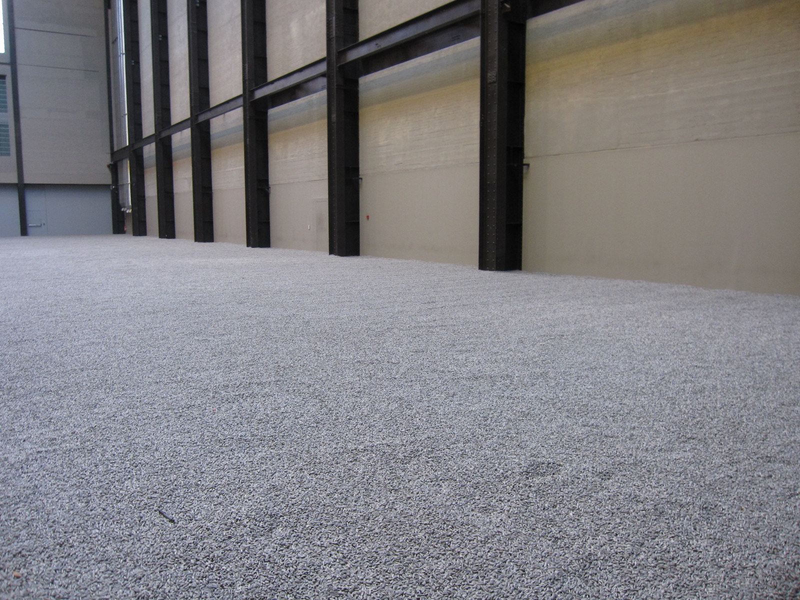
3. The Unilever Series: Al Weiwei: I appreciate that the sunflower piece is a commentary on the relationship of the individual to the masses; however, I am uncertain if the display answers such philosophical life questions such as "what does it mean to be an individual in today's society." If a visitor to the museum wanted to, I'm sure he or she could contemplate on the exhibit and extract answers to such poignant questions. In my opinion, however, I think the exhibit is intriguing and impressive without delving too far into its intention. When I first saw the sea of porcelain sunflower seeds from above, I honestly thought I was looking at gray textured carpet. Once I actually went down to the ground level, I was really taken aback. I could focus on one individual seed spilling toward the edge of the concrete plane they rested on, and then look up to see literally millions of these same seeds stretching to the exterior wall of the museum. I watched the short film on the artist's process, and I was struck by the scenes in which elderly Chinese women sat and hand-painted every single seed. For these women, I think it would be easier to distinguish and appreciate the value of individuality in the seeds, as they were the ones physically creating them. As a visitor to the museum, it is hard to fathom the work that went into each seed, yet I appreciated the magnitude of the project. In relation to the other installation art we have seen this semester, I like this exhibit the most. While it attempts to evoke reaction and contemplation in the philosophical realm, I am able to appreciate the beauty and simplicity of the work alone, which cannot be said for other exhibits (mainly the Coral Reef).


4. Display: I have noticed more and more with each museum we visit that the wall color, frame, and gallery arrangement have much more of an impact on how I perceive a piece of art than I originally thought. The striking white walls in modern art museums like the Tate usually make me feel uncomfortable. In galleries with sparsely hung, large pieces on utterly white walls, I feel pressured to be overwhelmed by a piece. There is so much attention and focus on one single piece because of the empty white walls surrounding it, and for some reason this is unsettling to me. Even if I genuinely like the piece, I still feel pressured to stare at it in awe for a long period of time. In contrast to this experience in modern art galleries, I have appreciated the variation in wall color, frame, etc. in the other museums we have visited, mainly the V&A and Tate Britain. Especially in the romantics gallery last week, I felt as ease with turquoise walls, gold frames, and salon style hanging, and I definitely prefer this arrangement to that in modern galleries.


5. Power Station to Museum: Tate Modern is architecturally the most unusual museum I've ever visited, both inside and out. When I first came to the Tate a few years ago, I was sure that my brother was wrong when he pointed from the Millennium Bridge and said "that's the Tate Modern museum." It does not look like an art museum, and in fact I initially thought it was a terrible eyesore on the Thames riverbank. Now that I've visited it a few times, I appreciate it more. The outside is striking and provoking, which is exactly what its subject matter aims to be. Inside, the amount of open space is overwhelming. It truly feels like a gutted power station, yet there are swarms of people clambering about. I also think the interior layers of the museum are interesting. The ground and first floors are bare, with the exception of a small cafe, gift shop, and the featured exhibit (in this case the sunflower seeds). The main exhibits are spread out on two floors, with a floor for special exhibits sandwiched in-between. The top floor is my favorite, because the view of the city is stunning, and you can mingle in a comfortable atmosphere when you inevitably need a break from the artwork below. I suppose the concept for this museum is not one I would have chosen, which would have been almost a cliche futuristic, ultra-modernist glass building of some sort. In comparison, I think i quite like the power state Tate Modern better anyway.

6. Object of Appreciation: My favorite gallery in the museum was the Soviet street posters room. The prints in this room were initially produced by the Bolsheviks after the Revolution, and were continually produced under the reign of Stalin. The brightly colored propaganda posters were visible across the Soviet Union. I love this gallery because every space on the walls in filled, from the floor to the ceiling. The images are bright and animated, which reinforces Soviet patriotism and allows for hyperbolic representation of the political adversaries of the USSR. My favorite wall in the gallery was a collection of posters aimed at women in the Soviet Union. The messages ranged from telling women to keep quite and not spread political gossip, to appeals to the Red Army to protect the endangered women and children of the Soviet Union. I like the combination of women portrayed as figured who can actually contribute to the political culture (as seen in the top two posters of strong-looking women), to ones in need of protection (in the lower two posters). My favorite print in the room in called "The Mullah's Third Wife" by Josiv Gerasimovich in 1926. There's no description of who the woman really is (besides being the Mullah's third wife), but I love the color and shape of the painting. I think the red is very striking, a color which is ubiquitous in all of the posters as a symbol of Soviet power. This poster is simply beautiful, and I would love to return to it at the Tate or have a print of it myself.


No comments:
Post a Comment